The Art Of Chakhsky by Noah Greenhalgh on Scribd
Monday, 19 December 2016
Chakhsky - Travelogue
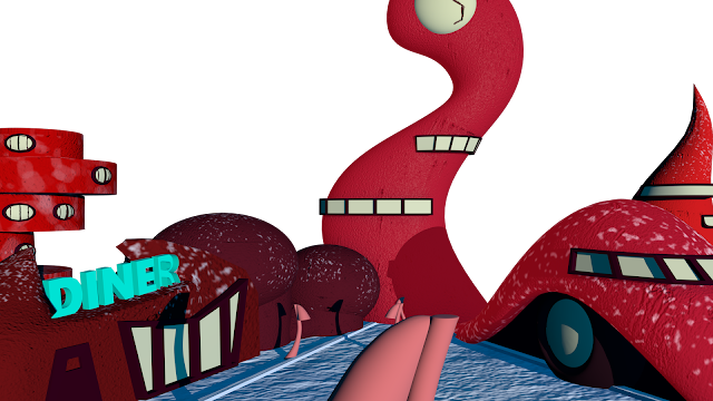
After trudging through miles of thick snow, shoulders hooked up to your ears, and your hat pulled down to your nose, you are relieved to see spherical silhouettes outline the horizon of the city of Chakhsky. You'd be forgiven for at first mistaking this vision of circles before you for clouds dotted against the blizzard skies.
Shuffling through the gates with eager anticipation, you can already feel the relief of a warm fire and quenched welcome of a hot drink. The brisk wind brings you back to reality. Between the shafts of falling snow, gleaming buildings bubble from beneath the stark contrast of white.
Stomping the snow off your boots as you walk down the icy streets, further into the city you notice that yours are the only fresh footprints pressed into the pavements.
Behind your layers of collars and scarves, your wandering eyes search inquisitively for the people of this curious city. In the oasis of the winter fields of Russia, you pull your coat tighter around your freezing body, skeptical that the weather may not be the only bitter characteristic of this city. To your relief, you spot an American style diner in the near distance. As you approach the diner you notice that it is missing it's familiar neon glow. Cupping your hands around your glassy eyes, your cold breath fogs up the windows as you peer through them. There are blown fuses, peeling paint, and worn leather seats.
The idea of the warm drink quickly fades as the truth of this city hits you. Long abandoned, the glossy fronts of the tall buildings reflect a sad and shallow history of Chakhsky; A delusional idea of the Big Apple built in a place it didn't belong.
What at first seemed charming and kitsch now only appears mismatched and out of place; the plastic fronts corroded away by young years of harsh climate. It is obvious that the dream in mind for this city was fast to fall. Though run down, the city has an eerily crisp, unused aura to it. What seemed like a refuge now feels like an ironic joke.
With a heavy heart, you too leave the city behind in search of a better place to stay.
What If? Metropolis - Reflective Statement
This project was a challenge. I felt like I had been thrown into this project a little, but because of the skills I learned in the previous invisible cities project, The project wasn't as stressful as it could have been. It was really frustrating trying to portray my concept art accurately in Maya, as I really struggled to try to use Maya without tutorials and for my own objects. However, I did really enjoy thinking of concepts and creating production art for the project. It was fun working with an artists style I had never really worked with, so I ended up creating a final product that I hadn't even thought I was capable of making. Anxiety and stress didn't help me out at all with this assignment, And I felt extremely overwhelmed with the amount of work I had and trying to organize myself, ended up in even more stress. however, I've finished it with a new set of skills that I can make stronger in future projects.
Thursday, 15 December 2016
Wednesday, 14 December 2016
Updated Background buildings UVs W.I.P
I'm really struggling with getting the UV layout right on this model, but this is how the model looks so far.
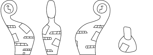
Remade Clocktower
I have remade my clocktower model so it looks like a more accurate version of the clocktower in my concept art, Also, my previous model (on the left) had a lot of problems, especially when trying to apply a UV layout.
Tuesday, 13 December 2016
Monday, 12 December 2016
Chakhsky Clock Tower Model W.I.P
To model this part of the Clock Tower, I used the lattice tool, and changed the size of the vertices to fit the sizes of my orthographic drawings.
I quickly added the clock face by using the texture tool, I deleted the faces I didn't need and created a sphere. Once I had scaled the sphere to the size I needed, I deleted the half of the sphere that isn't visible and then combined the two objects together.
Sunday, 11 December 2016
Chakhsky Lamp Maya Model
I modeled this lamp by using a polygon cylinder, cone, and sphere. I used the lattice tool to the create curves and shape my polygon primitives. This saved so much time, as I could have just tried to create the curve in the lamp by moving and scaling the vertices of the model. I also used the create edge loop tool to give the model more geometry.
Friday, 9 December 2016
Artist's Toolkit - Adobe Animate - Four Legged Walk Cycle
Today I animated a four legged walk cycle. This was challenging as I had to try and sync up the deer's legs properly, and I also struggled with drawing the deer as it's not something that I'm used to drawing. The legs are a little out of sync, making the deer look like it's limping. The animaiton is not as smooth as I would have liked. However, I'm still pleased with the outcome.
Wednesday, 7 December 2016
Tuesday, 6 December 2016
Maya Alley Model Progress - Part 1: Modelling
Friday, 2 December 2016
Adobe Flash- Throwing Animation
Today I animated someone throwing an object, using a video of myself as a reference.
I feel like my skills in using Adobe Flash are getting better the more animations I make, however I still haven't gotten the hang of making the animation look smooth and fluid, instead of jumpy. I might be able to solve this by adding more in-between frames and focus on making sure the proportions of the person I'm animating stays the same.
I feel like my skills in using Adobe Flash are getting better the more animations I make, however I still haven't gotten the hang of making the animation look smooth and fluid, instead of jumpy. I might be able to solve this by adding more in-between frames and focus on making sure the proportions of the person I'm animating stays the same.
Subscribe to:
Comments (Atom)


