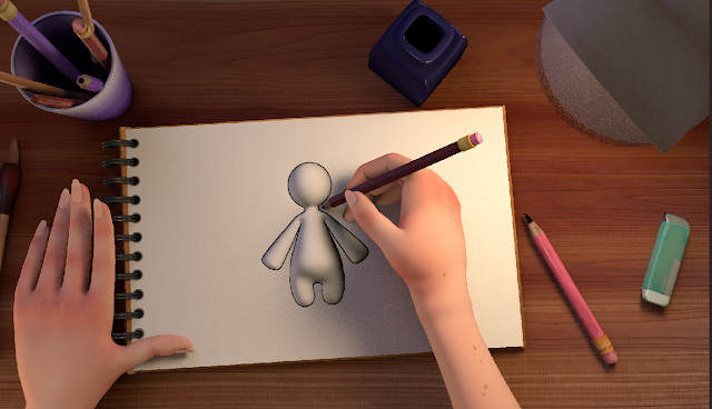
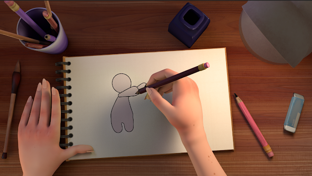
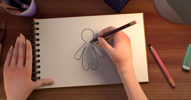
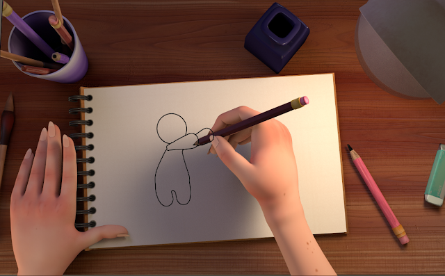
I've been working on the Toonshader a little bit and although it doesn't look perfect, I've fixed the issue of the shader only outlining the silhouette of Sketch, which lost lots of definition. I also played around with a few different texturing methods and I'm still not 100% happy with it, but it'll work for now until I can figure out something better.
I tried to apply the same texture of the book to sketch, with the toon shader outline. I wanted to try this out to see how sketch looked with a bit more definition. With this method, the shadows cast naturally from the hand onto Sketch. However, I really don't like how the added definition looks. It makes Sketch look too 3D and almost clay-like, rather than looking like a 2D drawing.
 |
| Experiment 1 with Book Texture |
Next, I tried the original method I used in the minor project which was chromakeying. I wanted to see how this would look now that my scene is properly set up. This is how it looks:
And when I render the Scene and the Artist, I will remove Sketch and only render the rest of the scene which will look like this:
Something that I had to figure out with this process was that I lost a lot of definition as the Toon outline was only lining the silhouette of Sketch. I fixed this by turning off ID difference, decreasing the Angle Threshold, and changing normal types to smoothed normal in the Attribute Editor. I don't know how this looks in an animated sequence though, So I'll have to try and render a small section of my animation to see if this actually works. I also don't like how Sketch's hands just seem to faze through the pencil and the Artist's hands, I tried fixing this but haven't come up with a solution yet.
 |
| Chromakey test with Green Hue |


Toon shaders (surface shaders) have luminocity which casts rays (light). There is not a setting to turn that off because its part of indirect (global illumination) rendering. You should composite your character into the scene (that way you can turn off indirect rendering for that pass). It is actually quite easy and will allow you to do other things in After Effects. For example, you can render the render you character as black an white (black lines/white body) and use a Matte Shader to cut out the rest of the scene. That way you can re-colour your character in AE (to what ever you like - Including the lines) by using leyer effects and the alpha channel (cut out). There is no additional render time. I can explain more on Basecamp.
ReplyDelete